Deep Design Dive: Pirate Seagulls

Hello and welcome back to another deep dive! We’re now officially into my favourite season of the year, and I couldn’t be happier. I love summer—the long, sunny days into warm evenings, everything outside is full of colour and completely overgrown, and of course, the lazy beach day trips spent on soft sand with the sound of the waves in the background.
As I write this, I’m actually sitting in Paris on what is officially the hottest day of the year (37°C!), and very much wishing I were on a beach somewhere instead, with the sea to cool off in. I just love that feeling of arriving at the beach, kicking off my shoes straight away to feel the sand beneath my feet, and heading straight for the shallows to walk barefoot in the water.
“Beaches have always felt like my happy place.”
I’ve been so lucky to have visited some truly beautiful beaches around the world, and no matter where it is, I always feel completely at peace by the sea. Whether it’s the windswept shores of Scotland, the pearly white sands of Australia, or the eerie, otherworldly stretch of the Skeleton Coast in Namibia, beaches have always felt like my happy place.

When I started planning my summer content, it was this love of the sea that really shaped the direction I wanted to take—but honestly, it’s just a coincidence that it’s this hot as I write this. I’d already decided to spend the next two months focusing on some of my sea-themed designs long before summer really showed up, but now it feels even more fitting.
And when it came to picking which one to dive into first, it felt like this was the perfect time to shine a spotlight on one of the creatures you’re always guaranteed to see on a trip to the coast: seagulls! Except in this piece, I gave them a twist—thanks to a little inspiration from a fellow maker friend of mine. It’s also been almost exactly a year since these characters made their debut, so what better time to revisit them?

The inspiration for this piece actually came from a chance meeting with another maker last July. I was taking part in the one-off Eden Court summer market in Inverness, and by pure luck, I was placed diagonally opposite Em—the maker behind Woodies Driftwood!
Em actually lives quite close to me and collects pieces of wood from Nairn beach, transforming them into the most amazing little sculptures. One of her most popular creations is her seagulls, a brilliant idea in itself, but it was her pirate seagulls that caught my eye. I absolutely loved it and when I went home that evening, I just couldn’t stop thinking about how brilliant the concept was. It reminded me so much of the seagulls from Finding Nemo—chaotic, loud, and weirdly endearing.
The next day, I went back and spoke to Em about the idea, and she was absolutely thrilled. I was so pleased to have Em’s encouragement throughout the process. It was really important to me that she felt involved and that it was clear I wasn’t just copying her work—I wanted it to feel like a playful nod to the idea that sparked it all.
We started chatting and ended up brainstorming all sorts of possibilities—from putting them inside a round bottle to playing with different compositions. At first, we thought perching them on a treasure chest would be best, but when I sat down to sketch it, it just didn’t feel like it was coming together the way I wanted.
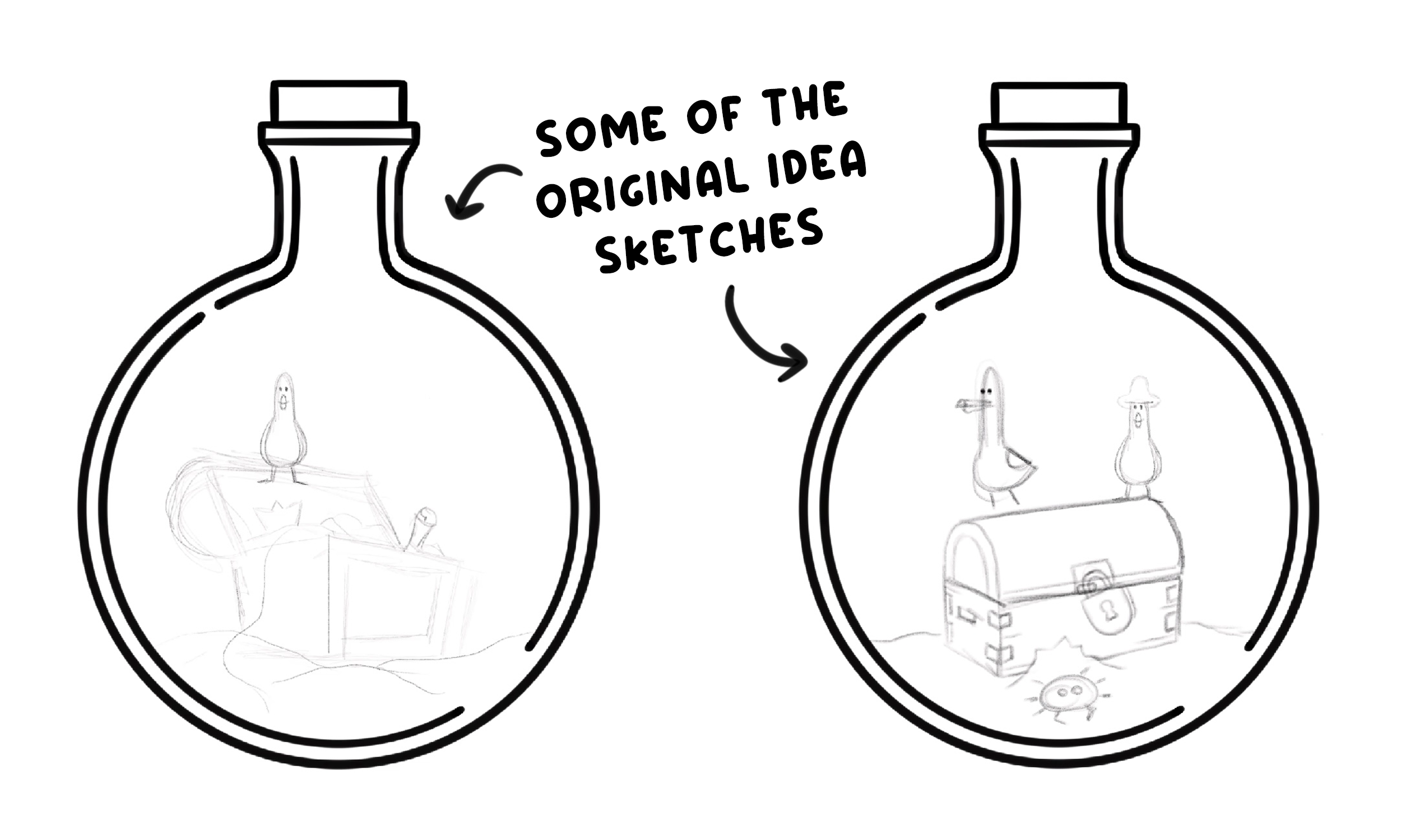

Watching the timelapse back, I actually don’t think the treasure chest idea was a bad one—but I think it reminded me too much of a design I made back in August 2023 for Vitamin Sea, which also featured a treasure chest. That particular piece was never a favourite of mine, which is probably why it’s never made it into any official collection. Looking back, I think that played a part in nudging me towards a different direction.
Once I sketched in the five wooden pillars, though, I knew I was on the right track. I definitely wanted to include multiple seagulls but I wasn’t sure at first how many. Three felt too few, and six or more would’ve been overcrowded. My mum always told me to “work in odd numbers,” and that advice always comes to mind when I’m composing scenes like this so, in the end, I settled on five.
“You can’t have pirate seagulls without a jolly roger or two!”
But I didn’t want one seagull perched on every pillar—that felt a bit too predictable. So, to break it up, I added one peeking out from behind another. This not only made the composition feel more dynamic, but also helped with the overall balance. The two seagulls on the left are perched on taller pillars, creating some height on that side, while the three on the right sit lower, giving the piece a sense of visual weight and stability. That cluster of three also added a nice rhythm and helped guide the viewer’s eye across the piece, giving it a more playful, well-balanced feel.

Dressing them next was such a fun part of the process—you can’t have pirate seagulls without a jolly roger or two! 🏴☠️ Every captain needs a crew as well, so I had a great time adding in eye patches, stripy T-shirts, and little neckties. But of course, pirates need more than outfits… they need treasure! 💰
I wanted them to be surrounded by their loot, scattered around like they’d just raided a chip shop bin—chaotic, messy, and proud of it 😅 I had so much fun with this part: tossing in pearls, diamonds, crowns, and even a treasure map and bag of coins. I think this might be the busiest composition I’ve ever worked on which definitely made it a balancing act—trying to capture that sense of playful chaos without tipping into something so cluttered it became overwhelming. But in the end, I really love how it turned out.
And then, of course, came the colouring. Always the part that gives me the most grief—but only because I know it’s what makes or breaks a drawing. Hindsight is a wonderful thing, and looking back, it feels obvious that a nautical piece would call for blues… but that didn’t stop me from testing out some wild colour choices first 😂
“So I Kept Experimenting with reds and pinks instead... but it just felt completely wrong every time.”
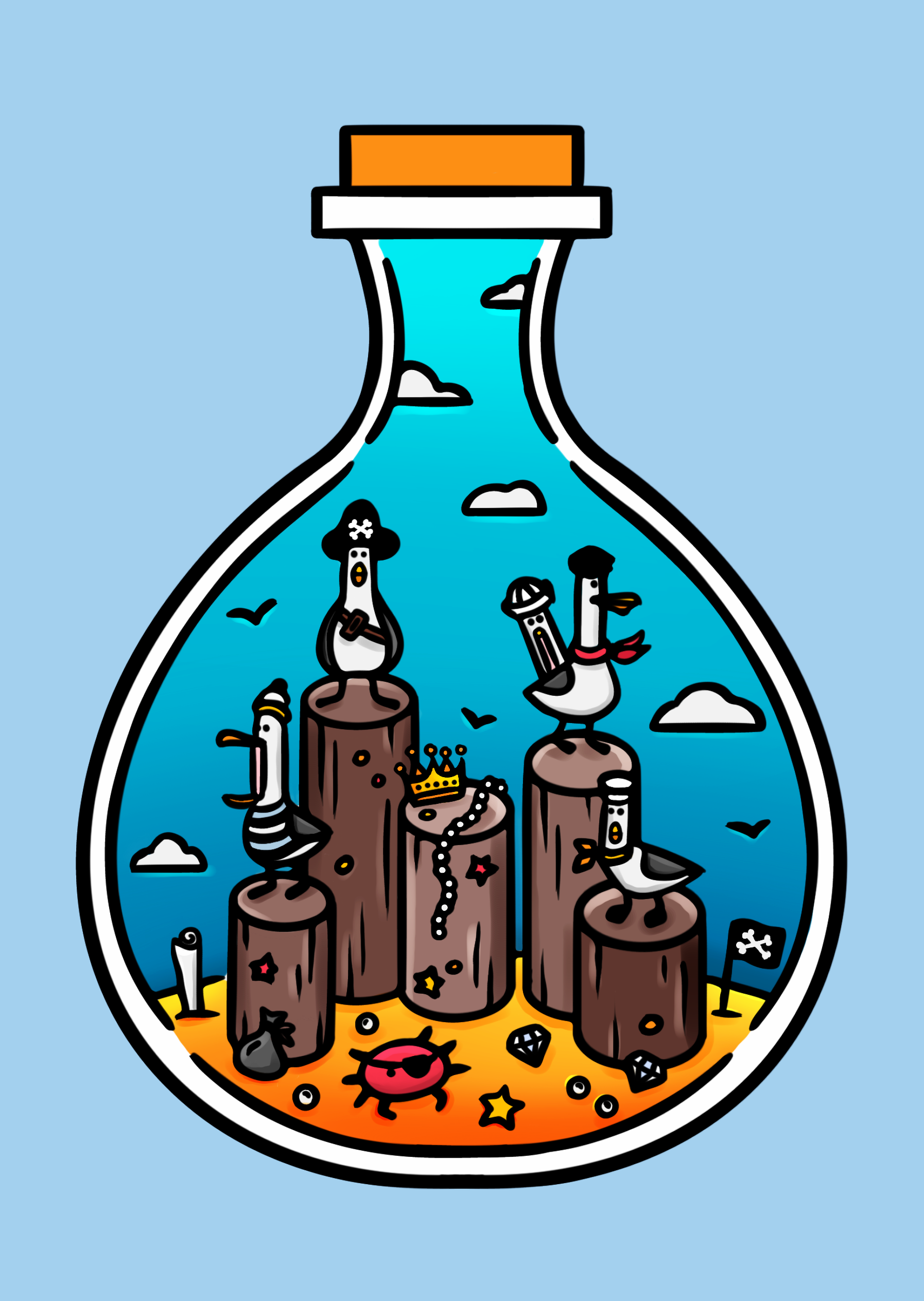
I always knew I’d end up with a traditional blue sky (though I did try purple at one point), but my usual method of choosing a contrasting colour for the main background really didn’t work this time. In theory, a yellow background would’ve been ideal—as yellow and blue are classic complementary colours—but since I wanted the sand to be gold, using yellow for both the sand and the background I decided just wasn’t going to work (ironic given the blue on blue backround it ended up being!) So I kept experimenting with reds and pinks instead… but it just felt completely wrong every time.
Eventually, I landed on using a lighter blue for the background. It wasn’t what I’d originally planned, but it captured that nautical vibe so perfectly that I knew it was the right choice. It also broke a few of my usual “rules,” as well. Most of my illustrations use about three main colours - any less, and it can be tricky to get enough variety and depth. Of course, there are exceptions—like my stag design, and in the end, this one too.
But I guess that’s the fun of art, really. Sometimes, a drawing just falls together with very little need to consciously draw on the lessons I’ve learned over the years. Other times, I have to lean on colour theory to guide me and help bring a stubborn piece to life. But occasionally, neither of those things quite work—and it’s through experimentation, persistence, and breaking the ‘rules’ that the artwork truly comes alive in the end.
As always, you can find the full timelapse footage of the entire drawing process just below.
Em was absolutely delighted with the final piece when I showed it to her, and she even includes some of the postcards as freebies in her online orders from time to time! You can check out her amazing driftwood creations here—and who knows, if you place an order, you might just find a little pirate seagull postcard tucked in with it.
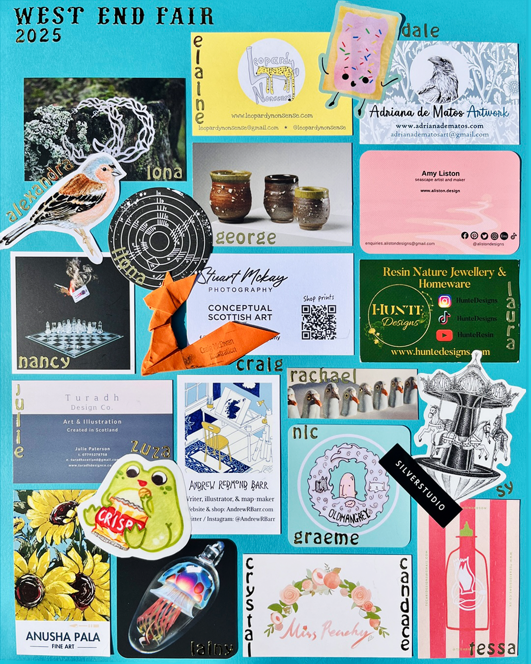
Or, if you’d like to pick up a postcard for yourself, you can find it—along with a selection of my other sea-themed designs—available in my shop below. Or come say hello at the West End Fair in Edinburgh next month, where this design (plus a few brand new, unreleased ones!) will be joining me in person.
If you enjoyed this post and want to stay in the loop, I’d love for you to join my email newsletter. I send one email a month with behind-the-scenes updates, blog roundups, early sneak peeks, and a few little extras just for subscribers. You can add your email just at the bottom of this page 😊
And speaking of sneak peeks—later this month I’ll be kicking off a brand new four-part blog series all about my artistic journey: from high school sketchbook beginnings to the many creative paths that eventually led me here. I’m really excited to share it with you and the first instalment is coming soon, so keep an eye out!
Until next time!
🩵
Beth x
Shop the ‘By The Sea’ collection Below