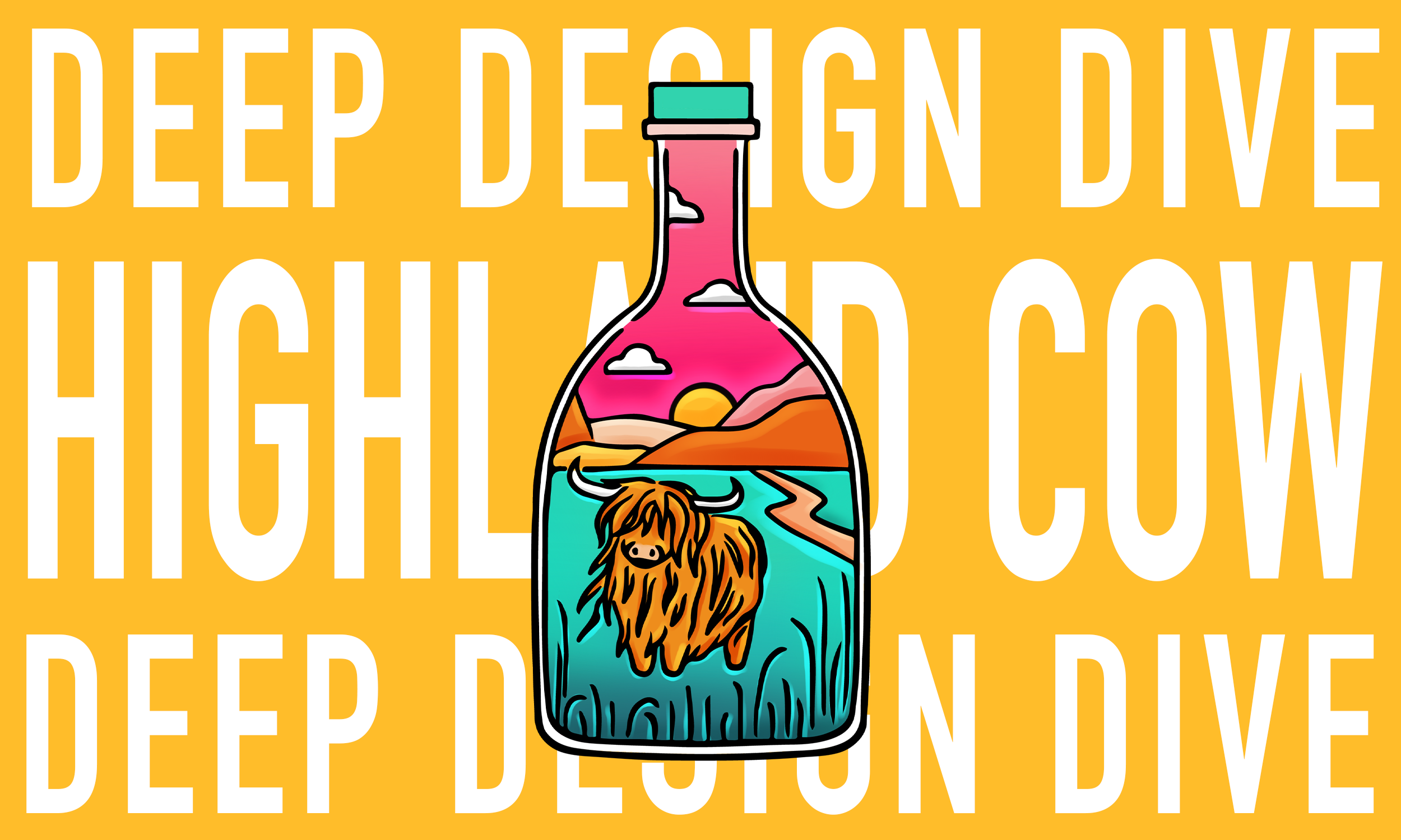
Deep Design Dive: Highland Cow
Hello again – and if you’re new here, welcome! I had such a good time putting together last month’s blog all about Nessie, and I’m so glad you’ve come back (or found your way here) for another Deep Design Dive ☺️. This time, I’ve decided that it would be fun to have a look at the Highland Cow design. One, because it’s another really popular design and two, because when it comes to talking about colour, this one really put me through my paces! 😅
“How do I do Scotland but different?”
I knew I couldn’t have a Scottish Collection without a Highland Cow design and so it had been sitting on my mental “to-design” list for a long time. But like with Nessie, it’s so popular and beloved that I knew I had to get it right, but I wasn’t exactly sure what ‘right’ was? I also really didn’t want to do anything that had been done before. That really was my entire goal with the Scottish Collection - how do I do Scotland but different? By this point I’d already managed to successfully do that for four designs but I knew I couldn’t put off the Highland Cow for much longer.
But let’s rewind slightly - all the way to December 2023. I’d just returned from Edinburgh, where I’d been celebrating Flatmas — a festive tradition I share every year with two of my best friends, Calum and Olivia. Calum always cooks an incredible Christmas dinner with every trimming imaginable while Olivia makes dessert (and I turn up 😂 along with some occasional guests), and we spend the evening playing board games, drinking wine, and watching whatever slightly obscure Christmas film Calum’s dug up. And of course, we always take our annual photo in front of the tree. 🎄
After that fun weekend, I headed home, where my family were house-sitting for a friend of my mum’s who was off in Australia for the month. I suppose it was slightly weird to celebrate Christmas not at home but then again, I once spent Christmas Eve and part of Christmas Day in a hotel which was definitely weirder! It worked out perfectly though as the house was beautiful and the place had loads more space.
“I wasn’t leaving until the Highland Cow design was done.”
By this point though, the holidays were fast approaching, and I knew I had to finish the Scottish range so I could send everything off in time for samples to arrive ahead of the Scottish Trade Fair in late January. So, a couple of days after I got back, with everyone else out for the day, I made myself a hot drink, sat down on the couch, and set a goal: I wasn’t leaving until the Highland Cow design was done.
When I started the composition, I knew the highland cow had to be front and centre. But for some reason, when I imagined the scene, I pictured it standing in front of the ruins of an abandoned castle. In my head, the real world setting was clear—but oddly enough, what I was thinking of wasn’t a castle at all. It was actually Ruthven Barracks, a large ruin that sits just off the A9, which I always notice when travelling to and from the central belt. Built in the 1700s during the Jacobite Uprising, it now stands as a crumbling relic—but it’s a striking sight, just casually there on the roadside as you drive past.
“…when in doubt, add some hills”
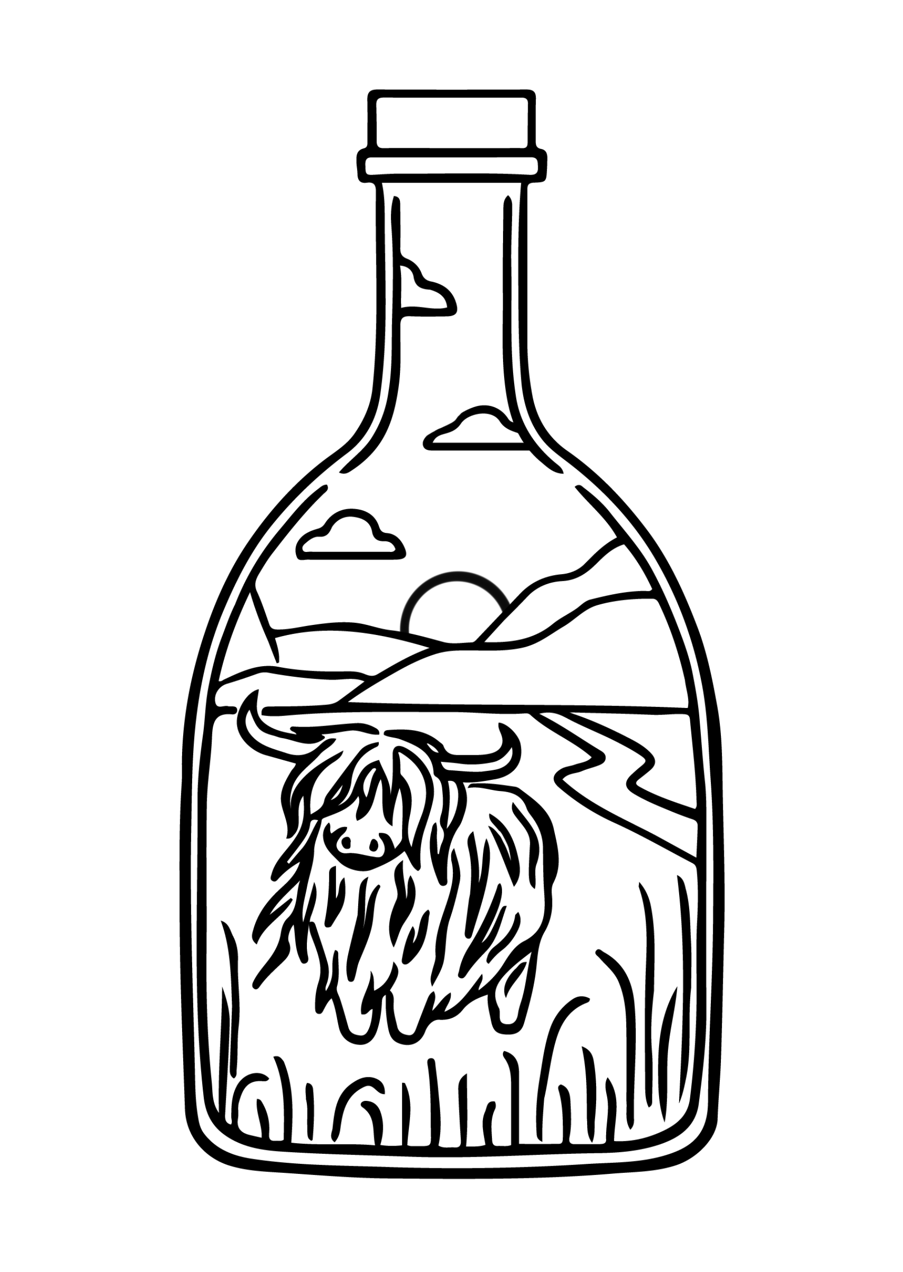
So that was the image I originally had in mind to sit behind the highland cow. But when it came to actually drawing it out, it didn’t quite work. Looking back, I think I was trying to make the ruin too detailed or complicated. As I sketched, it became clear that the ruins were taking attention away from the main focus of the cow. On top of that, the bottle shape I’d chosen made it even trickier. Trying to fit both elements into that narrow space felt like I was cramming too much in (this is why long-neck bottles are so hard to work with 😅), especially if I wanted the cow to remain the main feature. So, I scrapped the ruin and went with my default backup—when in doubt, add some hills 😂.
Now, full transparency: even though it might look like I’ve just stuck an object in a bottle and called it a day, I actually try really hard not to do that. I always aim to tell a little story within the bottle—something that helps people connect with the scene, even in a subtle way. That being said though, this might be the closest I’ve ever come to just… sticking something in a bottle 😂. Thankfully, the highland cow is such an iconic figure that seeing one in a field is exactly how most people encounter them so it still worked! But composition wise, this is one of my more simplistic designs and I know in the end it’s not the drawing itself that makes this one so popular—it’s the colours. And wow, did I have to work for those colours!
“Throw every colour under the sun at it and hope something sticks.”
Honestly, most of the time I go into a design with no clear idea of how I want the colours to look. I usually just have a thread of an idea for the composition and then sometimes it all just falls into place as I go, and other times I really have to dig into the colour theory I’ve picked up over the years. When I’m stuck, one of the things I find helpful is looking up other images that give off the kind of vibe I think I want to capture. This method only has about a 20% success rate 😂 but it does give me something to work from—even if it’s just confirming, “yes, I actually do like this background colour,” and building the rest of the palette from that one decision.
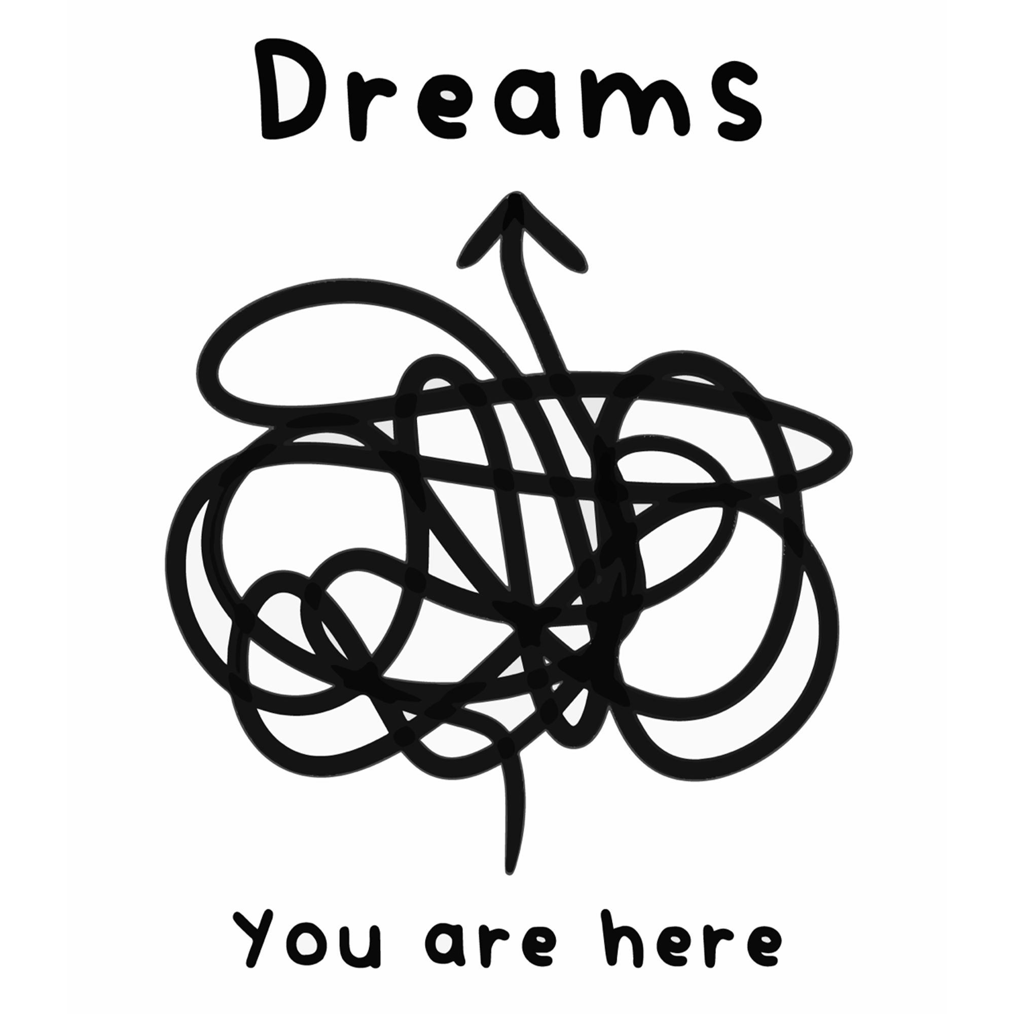
But for some reason, I completely blanked on this design. No matter what strange colour combinations I tried, nothing felt right. I did at least have one starting point: the highland cow obviously had to be some kind of golden-brown (even though their original colour was black—but let’s be honest, that’s not what most people picture when they think of a highland cow). So every reference image I pulled in had some variation of gold, orange, or red. But even with that, my actual process ended up being: throw every colour under the sun at it and hope something sticks. Watching the timelapse back… I’ll admit, it took me way too long to get to the part that finally worked!
Some possible other colour combos I tried!
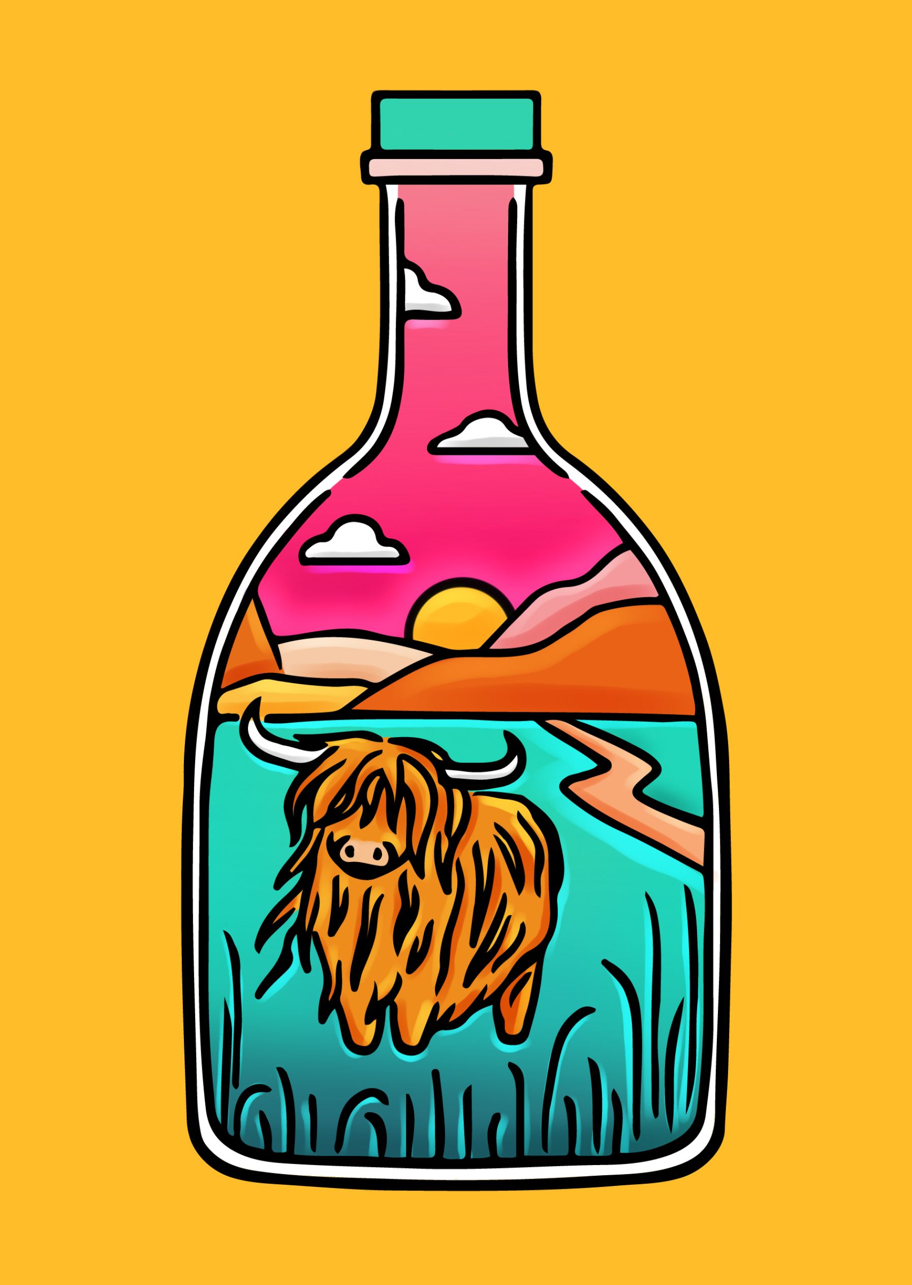
Eventually, after pulling up the fifth reference photo, something finally started to work. The moment I made the background gold, I knew it was the first solid colour choice I’d landed on. You can actually see it in the timelapse—I went from dark and stripped-back tones to brighter, bolder colours, and suddenly a pink sky against a gold background made perfect sense 😂. Since pink, orange, and gold all sit on the warm end of the colour spectrum, I knew the grass and bottle lid needed to be something cool-toned to balance it out.
At first, I tried a green-turquoise shade (because I love that colour), but it ended up feeling too close to green—and on the colour wheel, green blends into yellow, so they’re neighbours rather than contrasts. I adjusted it slightly to be more blue instead, and since blue and yellow are complementary colours, it just worked. That was the moment I knew I was finally on the home stretch. I proceeded to add in my signature shadings and finally could call this design complete.
“Sometimes art journeys are just that messy!”
Looking back on this one, I think it really proves that perseverance does pay off—even if the path to get there wasn’t exactly… efficient 😅. It took a lot of trial and error and far more colour choices than I care to admit—but sometimes art journeys are just that messy! And in the end, I’m genuinely so proud of where it ended up.
It’s now become my second best-selling design ever (right behind Nessie!) If you’re curious to see how it all came together, I’ve put the full timelapse below. It shows the entire process from start to finish—including all the chaos in between! Thanks so much for reading, and I hope you enjoy watching it unfold 💛
If you’ve enjoyed this little behind-the-scenes peek, let me know! I’d love to hear what you think of the final design—or even what colours you might have chosen. You can find the finished piece as pins, keyrings, prints, and more in my shop, or scroll below to browse.
And if you enjoy these kinds of behind-the-scenes posts, you can always join my mailing list (if you’re not already on it). That’s where I share first looks at new designs months before they go public—right now I’m in the middle of revealing my new collection exclusively to email subscribers. I also share early shop updates, exclusive offers, and other fun bits I don’t post anywhere else.
Thanks again for reading—and I hope you’ll stick around for the next one
💛
Beth x
