Deep Design Dive: Nessie

Welcome to The Blog!
If you’re reading this, then first of all—welcome, and thank you!
This blog has been bubbling away in the back of my mind for… well, a while now. But as it turns out, sitting down to write it was much easier said than done. That said, here we are—you’re reading this, and I’m finally hitting ‘publish’ on my first ever blog post. 🎉
“What’s your inspiration?”
So… Why a blog?
The idea for the blog really came about when I started thinking seriously about the kind of content I wanted to share—but more importantly, the kind of content I thought you might want to see from me.
And when I looked back over the past year and a half of running my business—through markets, trade fairs, and all the lovely face-to-face chats I’ve had along the way—the most common question people ask me is: “What’s your inspiration?”
And honestly? That’s a really hard question to answer in just a few sentences.
Each design is inspired by something different. It could be a favourite video game, a place I grew up or visited, or just a random niche idea sparked by a passing interest. Sometimes, my designs are heavily shaped by what’s going on in my life at the time. And sometimes, I start with one idea and end up somewhere completely unexpected.
“While all of that is true, it’s definitely not the full story.”
So if you’ve ever asked me that question, I probably gave you the same elevator-pitch I’ve now perfected over the last couple of years: that when I first started creating art to sell—around two and a half years ago—it was just before Christmas, and I had the idea to do snow globe-style scenes but in bottle shapes. At the time, I was doing very realistic artwork (you can see it here if you’re curious), and the idea didn’t quite work. A few months later, I tried again in a totally different art style—and well, the rest is history.
And while all of that is true, it’s definitely not the full story.
So I’ve decided to use this blog to start a series called Deep Design Dive—a concept loosely inspired by one of my favourite YouTubers, MicTheSnare, who does a similar series but about music (if you’re into music, I highly recommend checking him out). In this series, I’ll pick a design and do a proper deep dive into what inspired it, how it came together, the behind-the-scenes process, and what was going on in my life at the time that shaped the final piece.
And what better way to start off the series than with a design that’s truly beloved:
Let’s Start With Nessie
When I first sat down to choose a design for my very first Deep Design Dive, I really struggled to pick just one. But as I reflected, it quickly became clear that one design in particular was the perfect place to start.
Nessie has been a fan favourite since the very beginning, and she’s incredibly close to my heart too—so beginning with her just felt right. In this post, I’m excited to take you behind the scenes of how this iconic creature emerged from the depths of my childhood and into one of my most beloved designs.
“My friends and I used to joke that my family was slowly making it’s way around the Loch.”
Growing up beside Loch Ness, the legend of the monster wasn’t just a bit of folklore—it was part of the backdrop of my everyday life. My family moved to Scotland when I was five years old, and we first settled in a small village called Drumnadrochit, known for the iconic Urquhart Castle that you’ve probably seen featured in any postcards of the Loch. After a couple of years there, we moved into Inverness for a while, before eventually settling in another village on the opposite side of the Loch: Dores. My friends and I used to joke that my family was slowly making our way around the Loch but it was in Dores that we eventually stayed for the rest of my childhood.

When I look back on those years, I think of waking up each morning to a view overlooking the Loch, long dog walks through the forest, and yearly Guy Fawkes traditions with bonfires, fireworks, and sparklers on the beach. I remember makeshift rope swings, building dens, and—when I got older—camping with friends, all of it backdropped by that vast, mysterious loch. It was such a beautiful place to grow up, and now, as an adult, I treasure those memories deeply.
“If I couldn’t get the products to sell in peak Christmas time, had it all been a failure?”
Fast forward to December 2023: I’d only launched my first ever designs a few months earlier, and by then they’d already made their way into my very first stockists. I was also in the middle of my first Christmas market season—something I had been so nervous about. It felt like all of 2023 had been building up to this moment: months of planning, designing, and getting products made, and now came the real test. If I couldn’t sell during peak Christmas time, had it all been a failure?
Ironically, my first market was exactly that—a massive failure. But the two that followed were a turning point. They were a huge success and really proved to me—and to a few people around me who had their doubts—that this idea of mine wasn’t just a dream. It could actually work.
For a while, people had been suggesting I create something with a more distinctly Scottish feel—but every time I sat down to try, nothing quite clicked. I’d actually attempted a Nessie design back in the October, but something about it just wasn’t working, so I shelved it (something you’ll come to find I do quite often!). But with the Scottish Trade Fair coming up in January—and knowing I’d be presenting my work to Scottish businesses for the first time—I felt a real pressure to create something that would resonate. So, after wrapping up my final Christmas market at Cawdor, I cleared some space, sat back down, and gave Nessie another shot. And this time, it really came to life.
When I first attempted the Nessie design, I started with a circular bottle shape. And while there was nothing technically wrong with it—in fact, when I dug it out again recently, I was surprised it wasn’t nearly as bad as I remembered—it just wasn’t what I had envisioned. At the time, I knew it wasn’t quite there.
I’ve come to learn that choosing the right bottle shape is crucial to the success of a design. I actually used to begin with the bottle shape and then build the design around it. These days, though, I do the opposite: I focus on the central idea first, then choose a bottle that suits and supports it.
Back then, I tried to fit Nessie into the bottom half of the circular bottle, and above her, I initially added a more realistic version of Urquhart Castle. But it didn’t sit right—it felt out of place with the overall style—so I ended up simplifying the castle into the version you now see in the final design.
After many attempts at hills and clouds (I hadn’t quite landed on my go-to cloud style yet), I still wasn’t convinced the design did justice to the memory of Nessie I had in my mind. And when I looked at it again two months later, I was sure of it—so I scrapped it and started fresh, with a blank canvas.

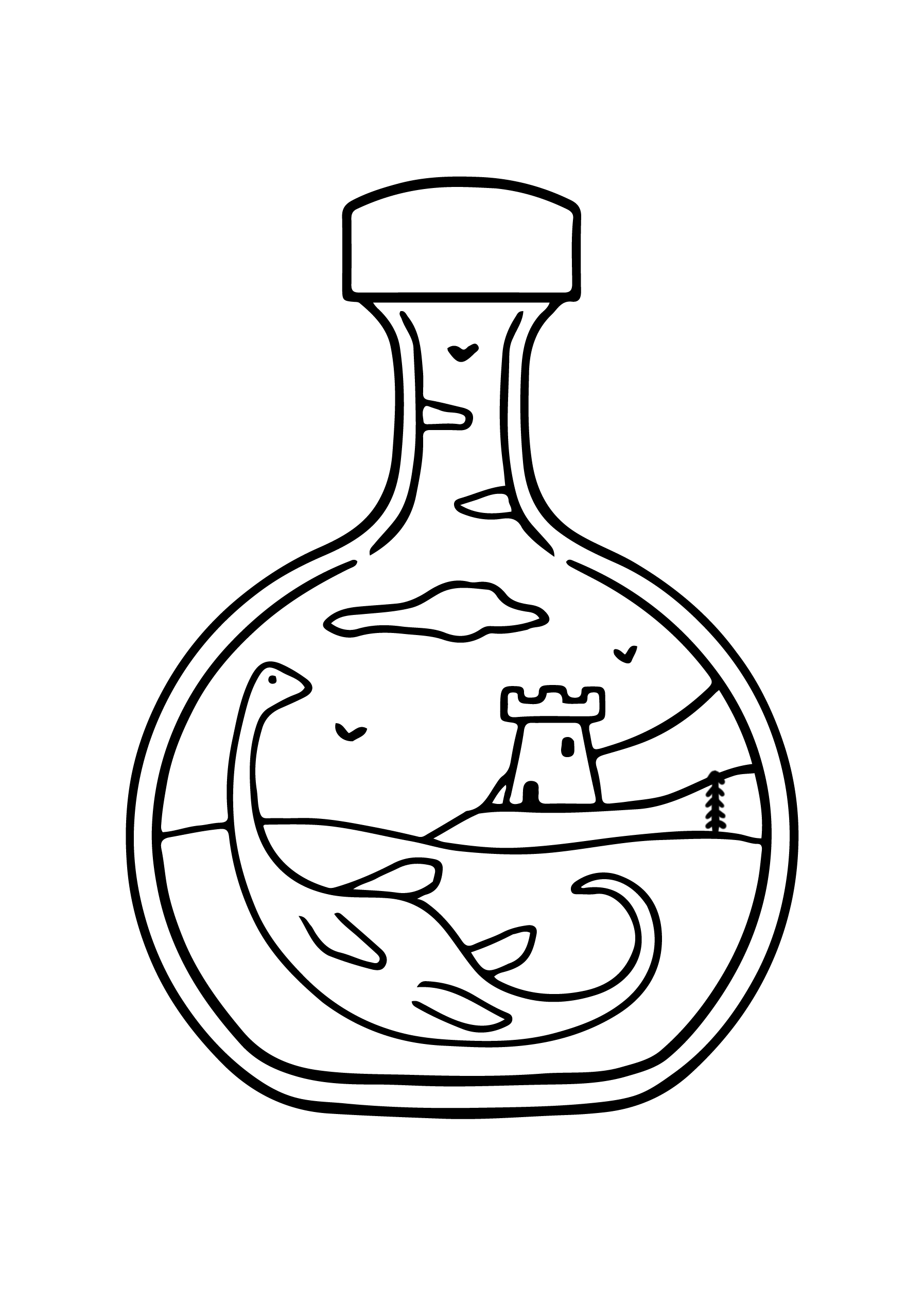
Coming back for round two, I decided to start with a more vertical bottle shape. Vertical bottles are actually the trickiest to design scenes for—the thinner they are, the harder it gets. That’s because you need to create a layout that extends upward, which can be limiting depending on the subject matter. But in this case, it worked perfectly. Instead of having Nessie mostly underwater, I thought—what if she stretched the full height of the bottle, with her head poking out just above the surface, like those iconic Nessie sighting photos?
Turns out, that approach worked brilliantly and felt like the right way to tell her story. I added three hills to offset Nessie’s angle, three clouds (now in my signature style), and some filler birds and trees—my go-to for keeping scenes full but not cluttered. With the layout locked in, it was finally time to move on to colouring.
Now, while colouring might seem like the final step—the finishing touch—for me, it’s often where the real challenge begins. I’ve lost count of how many people have told me that it’s the colours that really make my art. And I’d agree. The drawings themselves are simple in style (though deceptively tricky—it’s a real challenge trying to tell a story with just a few carefully chosen elements), but it’s the colour that truly brings the scene to life. Sometimes I go through countless colour palettes before finding the one that actually works. Even after years of studying colour theory, it still often comes down to gut instinct, trial and error, and sheer persistence.

Thankfully, this time was a little smoother. I’d recently seen an illustration of the Fairy Glen on Skye by Printagonist that showed the hills in lush green, with a stunning red and yellow sunset behind them. It reminded me so much of the beautiful sunsets we used to get over the Loch, and the way everything turns ridiculously green in summer. The Highlands at that time of year are breathtaking—the long days, the overgrown landscapes—that was the vibe I wanted to capture.
So, I went with vibrant green hills, a rich red sunset, and a teal Loch to finish it off. Usually, I contrast the background colour with the main tones inside the bottle, but this one was tricky. The palette was evenly split between green, red, and teal. I first tried a green background, thinking a fourth colour might overwhelm the design—but it didn’t sit right. Then I switched to a softer, baby blue—and just like that, Nessie was done.
Looking back, it’s funny to think how much hesitation I had at the start—how I had shelved the idea before finally landing on something that felt right. But now, Nessie stands as one of my most loved and recognisable designs, and I’m so glad I trusted the process (even when it felt like it wasn’t going anywhere).
Here’s a full timelapse of the Nessie design—from my original shelved attempt back in October to the final piece you see today. It’s not often I share the early versions, but I thought it would be fun (and maybe a little reassuring) to show the reality about how a design can evolve over time.
I hope you’ve enjoyed this first Deep Design Dive and a little peek behind the scenes of one of my most personal pieces. It’s been so fun revisiting and reflecting on this design - how it began and how it eventually came to life. If you enjoyed it too, I’d love to hear your thoughts in the comments below, including which design you’d like to see next!
And if you’d like to see more behind-the-scenes content, sneak peeks at unreleased designs, and general updates on what I’m working on, feel free to sign up for my monthly newsletter below. As a little thank you, you’ll also get 15% off your next purchase when you join.
Thanks so much for reading and I’ll see you on the next dive!
💛
Beth x
Shop the Nessie Collection Below


